
The Right Way to Prep Artwork for Screen Printing
How to Set Up Artwork for Screen Printing (The Right Way)
Screen printing does not start at the press. It starts with the artwork. If your file is off, the print will be off. It is that simple.
A lot of issues people run into like fuzzy edges, colors not lining up, or prints looking cheap usually trace back to how the artwork was set up.
In this post, I am walking through how I prep artwork before it ever touches a screen. This is the same process we use in the shop. Nothing fancy, just what actually works.
We will cover printing in another post. This one is just about getting your art ready so everything else goes smoothly.
What You Will Need
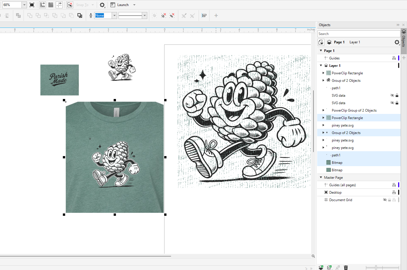
Some kind of design software like CorelDRAW or Illustrator
A photo editor like Photoshop or GIMP if you are working from an image
Artwork that is as clean as you can get it
A general idea of how many colors you want in the final print
Step 1: Start With the Best File You Can
If you have vector artwork, you are in good shape. That is the ideal starting point.
If you have a low quality image, you are going to need to clean it up first.
Basic cleanup looks like this:
Increase contrast so the design is clearly defined
Get rid of noise and blurry edges
Try to reduce it down to solid black and white if possible
If the image is really rough, it is often faster to redraw it than to keep trying to fix it. Not the fun answer, but usually the correct one.
Step 2: Keep Colors Simple
Screen printing works best with solid colors.
That means:
No soft fades
No transparency
No subtle shading
If your design has shading, you have two options:
Simplify it into solid shapes
Convert it into halftones, which is basically a dot pattern that tricks the eye into seeing shading
If you are not sure, keep it simple. Clean, solid artwork almost always prints better.
Step 3: Separate the Colors
This is where the process really starts to matter.
Each color in your design gets printed separately. That means each color needs its own layer.
For example, if your design has black, red, and white:
That is three layers
Three screens
Three passes when printing
In your design file:
Put each color on its own layer
Make sure everything on that layer is truly that color
Label your layers so you can keep track
Easy check:
Turn off all layers except one. You should only see that color. Do that for each one.
Step 4: Give Yourself a Little Room (Trapping)
In a perfect world, every color lines up exactly. In reality, things can shift just a little when printing.
Trapping helps hide that.
All it means is slightly overlapping colors so you do not end up with tiny gaps between them.
Example:
Let the bottom color extend just a bit under the top color
You do not need much. Just enough to cover small movement during printing.
Step 5: Add Registration Marks
These are your alignment guides when printing.
They are usually small crosses or targets placed outside the design.
Important things:
Every color layer needs the exact same marks
They need to be in the same position on every file
They should be easy to see
If your registration marks are off, your print will be off. No way around it.
Step 6: Use Halftones When Needed
If your design needs shading or gradients, you will use halftones.
Instead of a smooth fade, the image is made up of tiny dots.
A few things matter here:
Dot size
Line count (how tight the pattern is)
Contrast
Too fine, and the screen will not hold the detail. Too coarse, and it looks rough.
If you are new to this, it is usually better to avoid halftones until you are comfortable with the basics.
Step 7: Print Your Films
Once everything is set up, you will print a film for each color.
These are what you use to burn your screens.
Make sure:
All artwork is solid black where ink should go
No gray unless you are using halftones
Registration marks are included
Your prints are dark and opaque
If your films are weak, your screens will be weak. That shows up later when you are printing.
Step 8: Do a Final Check
Before you burn screens, take a minute and look everything over.
Are the colors separated correctly
Do the layers match what you expect
Are the registration marks lined up
Does the design look right at full size
Fixing problems here is quick. Fixing them later is not.
Final Thoughts
If you get the artwork right, the rest of the process gets a lot easier. Prints line up better, colors look cleaner, and you spend less time troubleshooting.
Most bad prints are not a printing problem. They are an artwork problem that shows up later.
Take the time to set it up right, and you will see the difference immediately.
Next Time
Next time, we will walk through what it takes to expose the screen and get it ready for printing.
If you have a design you are not sure about, feel free to reach out or stop by the shop.
